

&sons
Branding • Strategy • Packaging • Digital
Branding • Strategy • Packaging • Digital

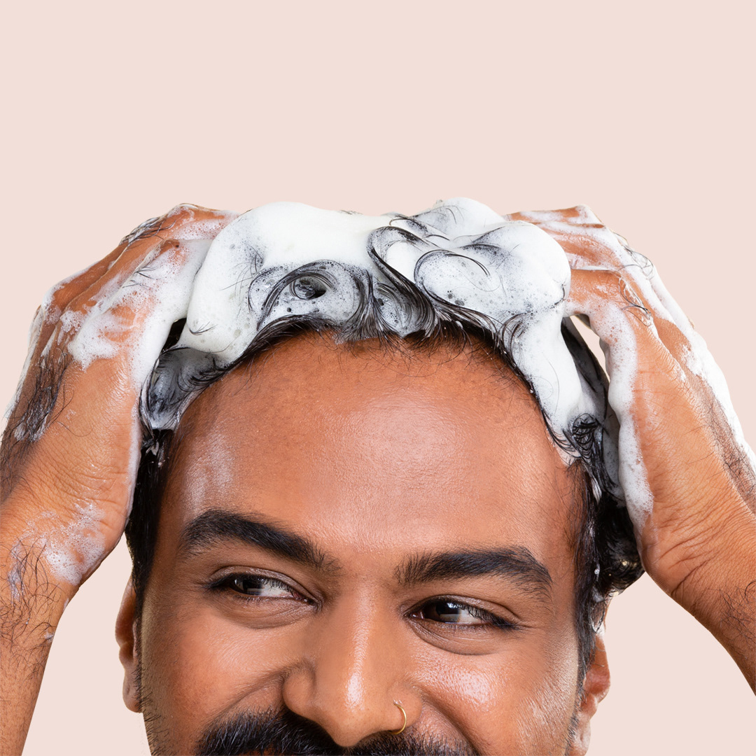
&sons is a men's healthcare brand that is made in labs, backed by science.
A Malaysian brand that focuses on prevention and accessibility for your everyday man.
A Malaysian brand that focuses on prevention and accessibility for your everyday man.

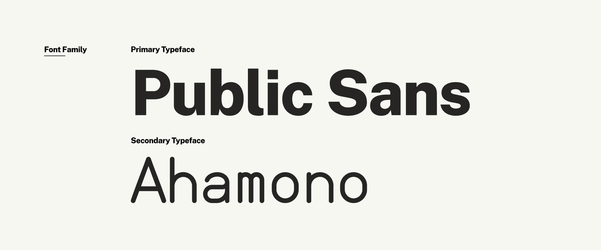
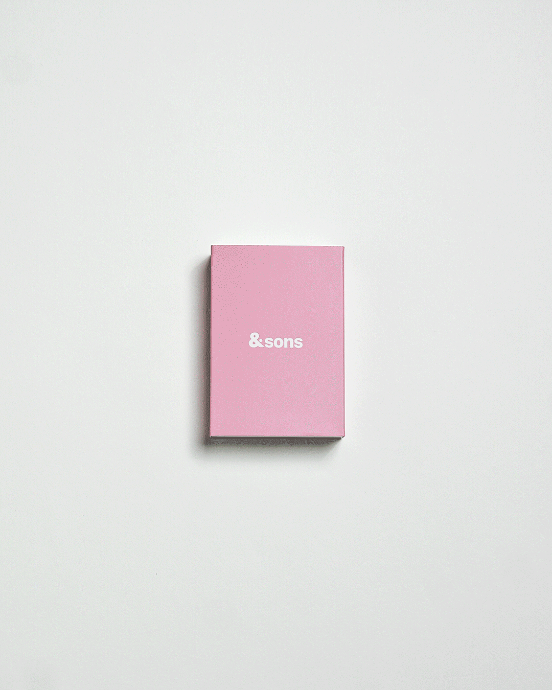
Brand Identity
The brands identity has a minimal, contemporary and fresh look and feel. Since it's a healthcare brand, it needs to be legitimate but with a twist. The objective was to break gender stigma and we played around with brighter colours and gender neutral typography. Textures and scribbles give depth to the brand and reflect a pharmaceutical vibe.


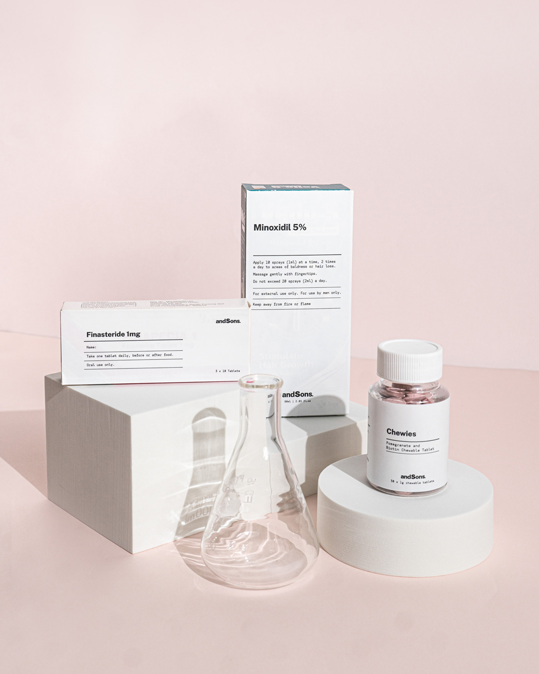
Packaging
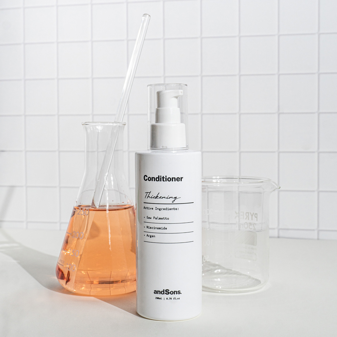
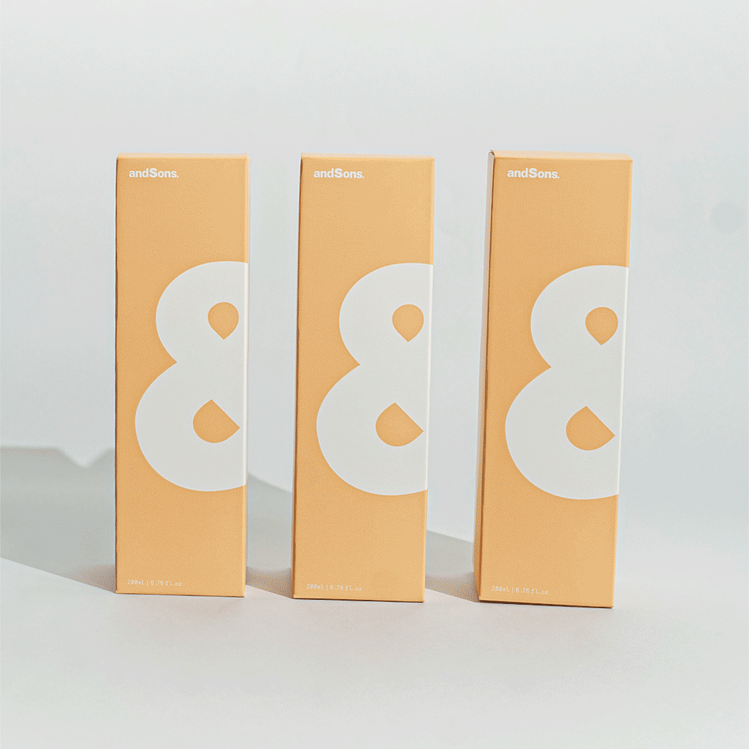
The juxtaposition of the colourful boxes and stark white bottles is an interesting way to package pharmaceutical products. Pop of bright colours compliment and contrast the clinical design. The ampersand is a key highlight of the design and signifies continuity and reflects the design of the box.

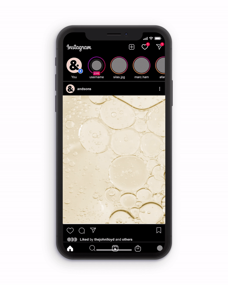
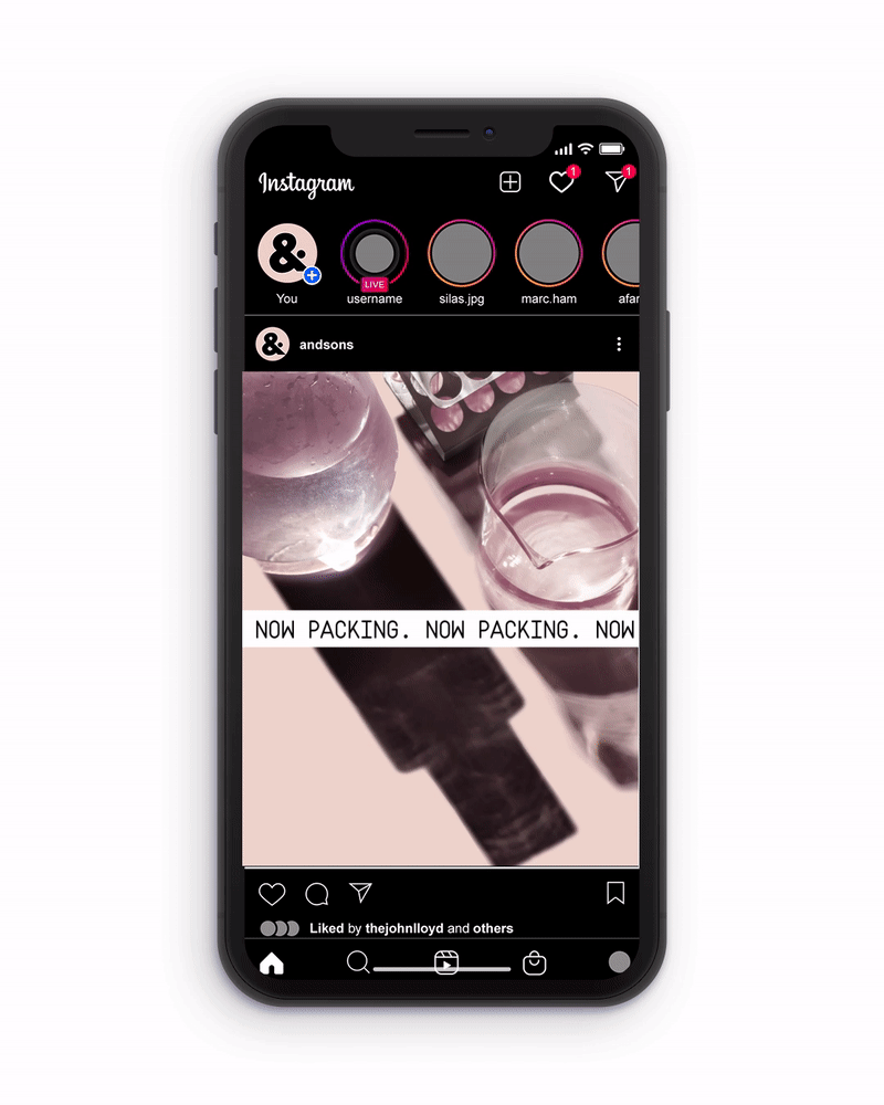
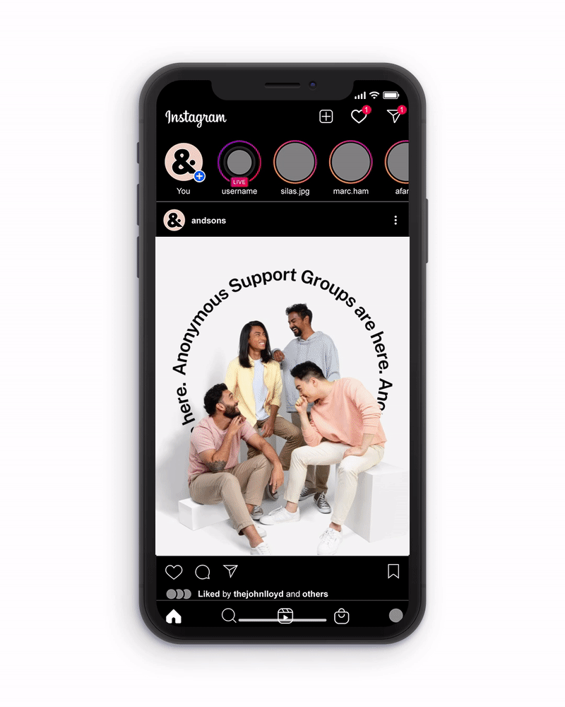
Social Media
The exciting part of the brand is their social content, there's liberty in using all the elements while maintaining it's objective to educate and inspire the users.